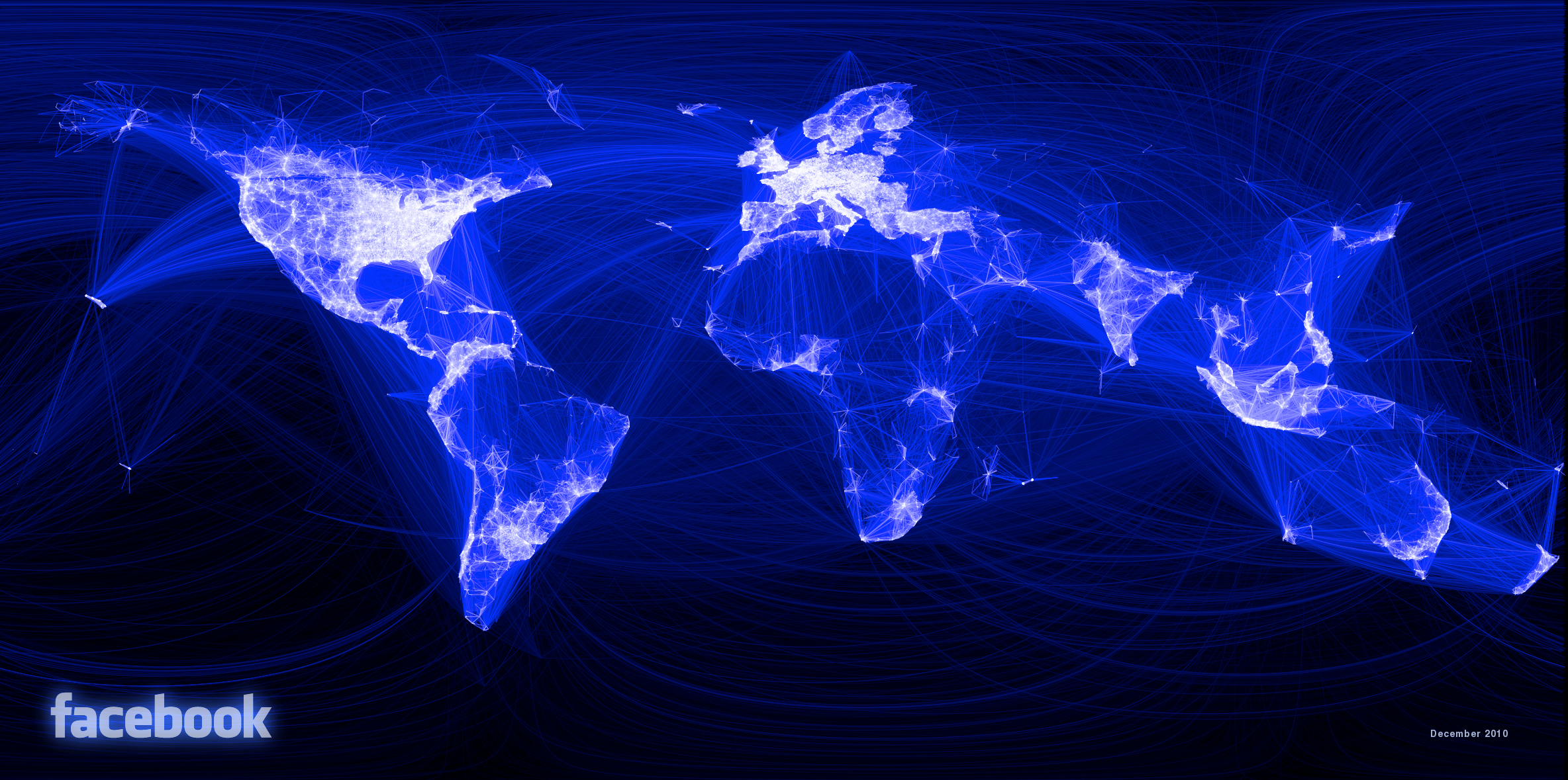
Description
Map of Facebook friendships by Paul Butler, created in December 2010 while he was a data science intern at Facebook. It became one of the most shared data visualizations ever. Using Facebook's social graph data, Butler plotted great circle arcs between the geographic locations of connected friends, with line brightness proportional to connection density. The resulting image — produced without any underlying base map — reveals the outlines of continents, national borders, and population centers purely through the density of human relationships. Notably, the map shows dark spots where Facebook had low penetration (China, Russia, much of Africa) and bright corridors between diaspora communities. The visualization inspired Olivier Beauchesne's Scientific Collaboration Map and dozens of similar network geography projects.