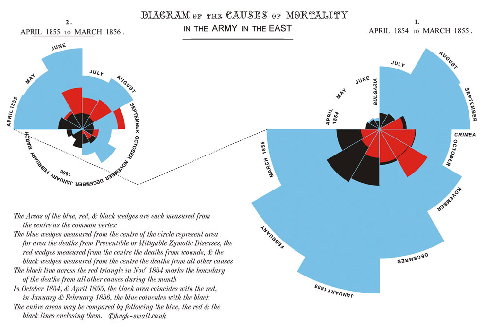
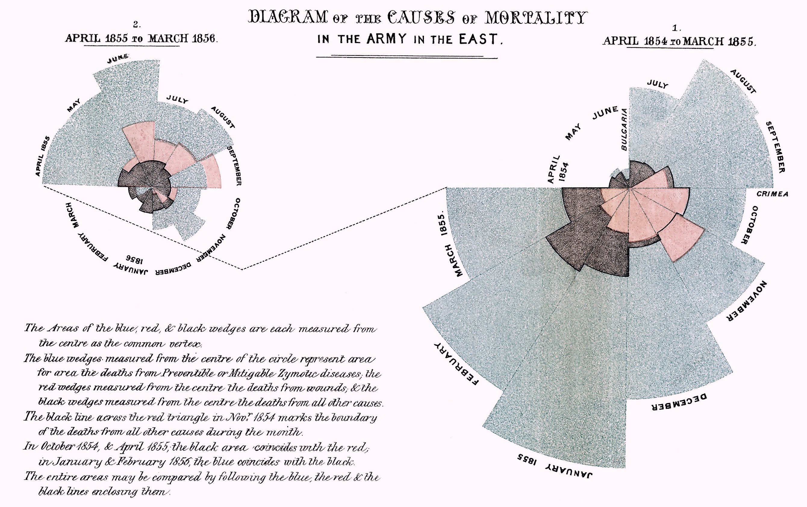
Description
Florence Nightingale's polar area diagram from 1858 showing causes of mortality in the Crimean War (1853-1856). Her innovative "coxcomb" charts — formally titled "Diagram of the Causes of Mortality in the Army in the East" — demonstrated that preventable diseases killed far more soldiers than battle wounds or other causes. The blue wedges (zymotic diseases like cholera and typhus) dwarf the red (wounds) and black (all other causes). Nightingale, a trained statistician as well as a nurse, used these graphics to persuade Parliament and Queen Victoria to improve sanitary conditions in military hospitals, saving thousands of lives and pioneering the use of data visualization for policy advocacy.