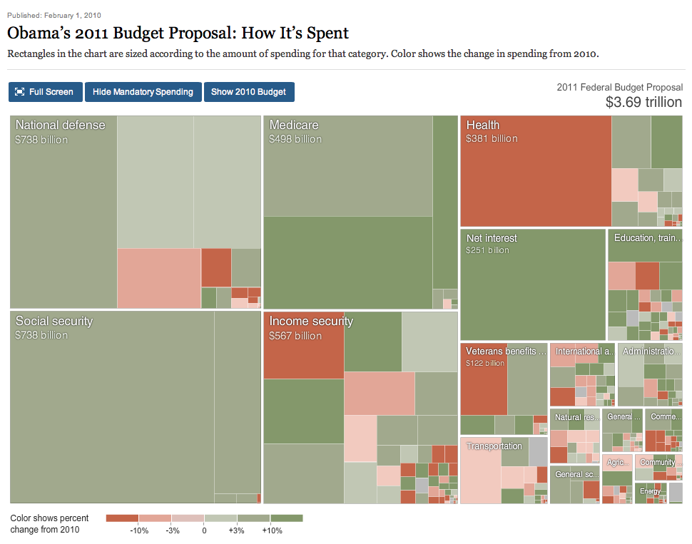
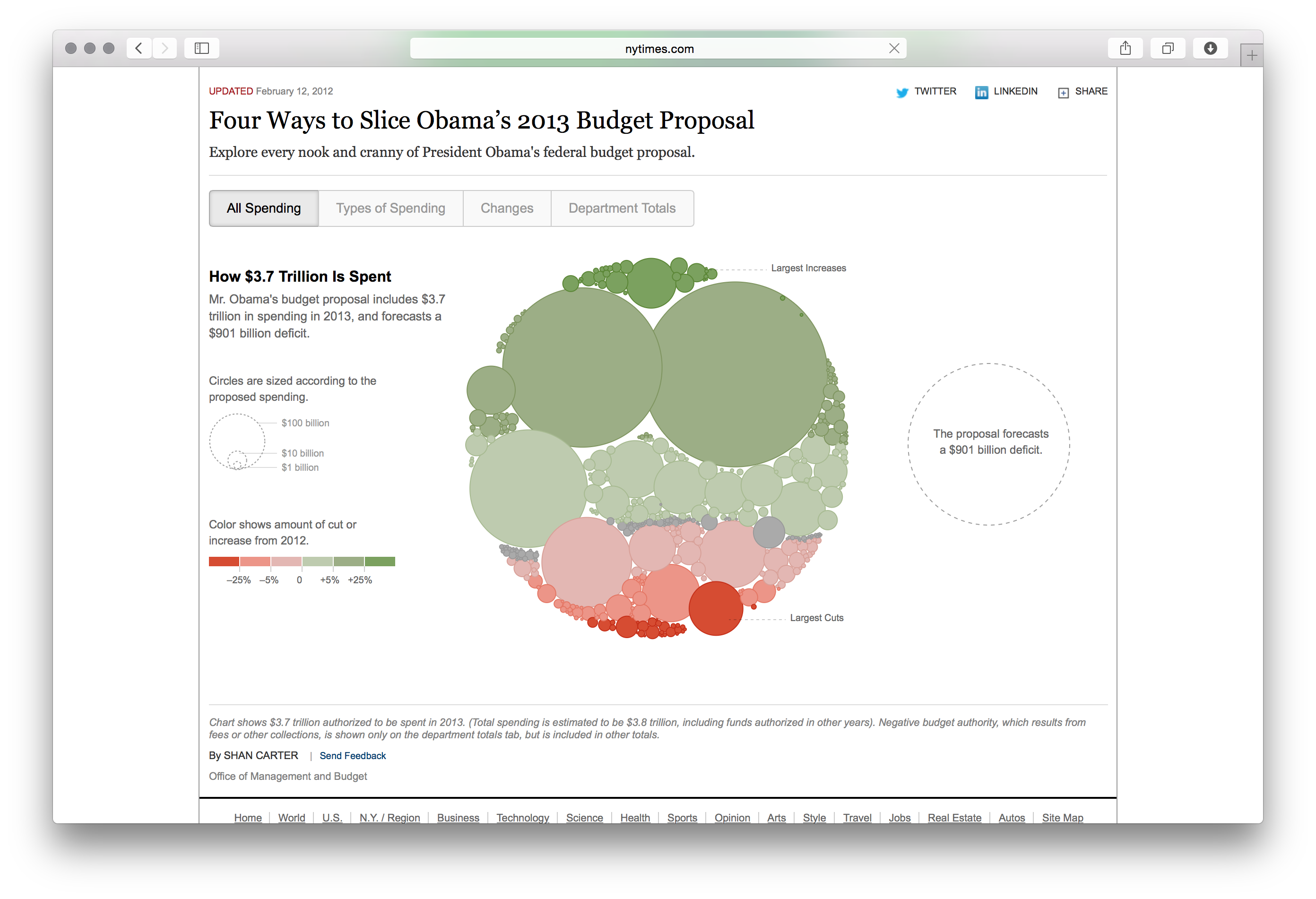
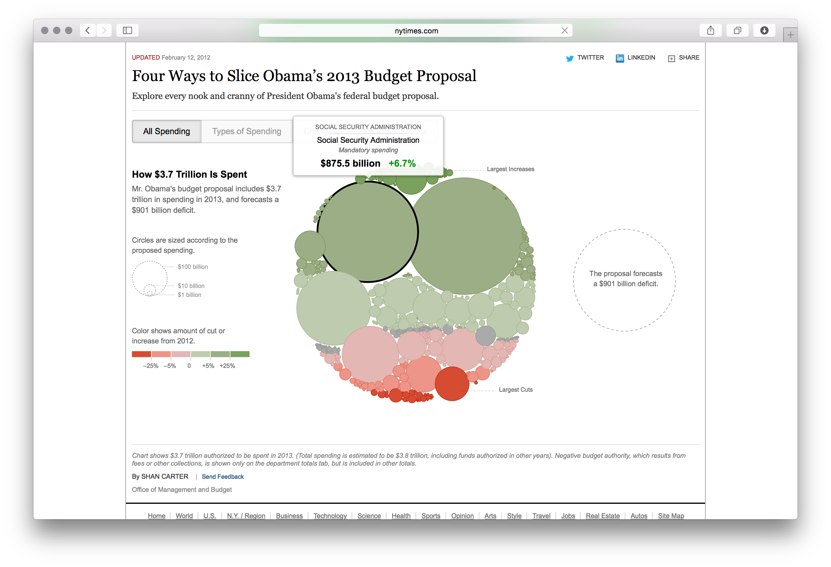
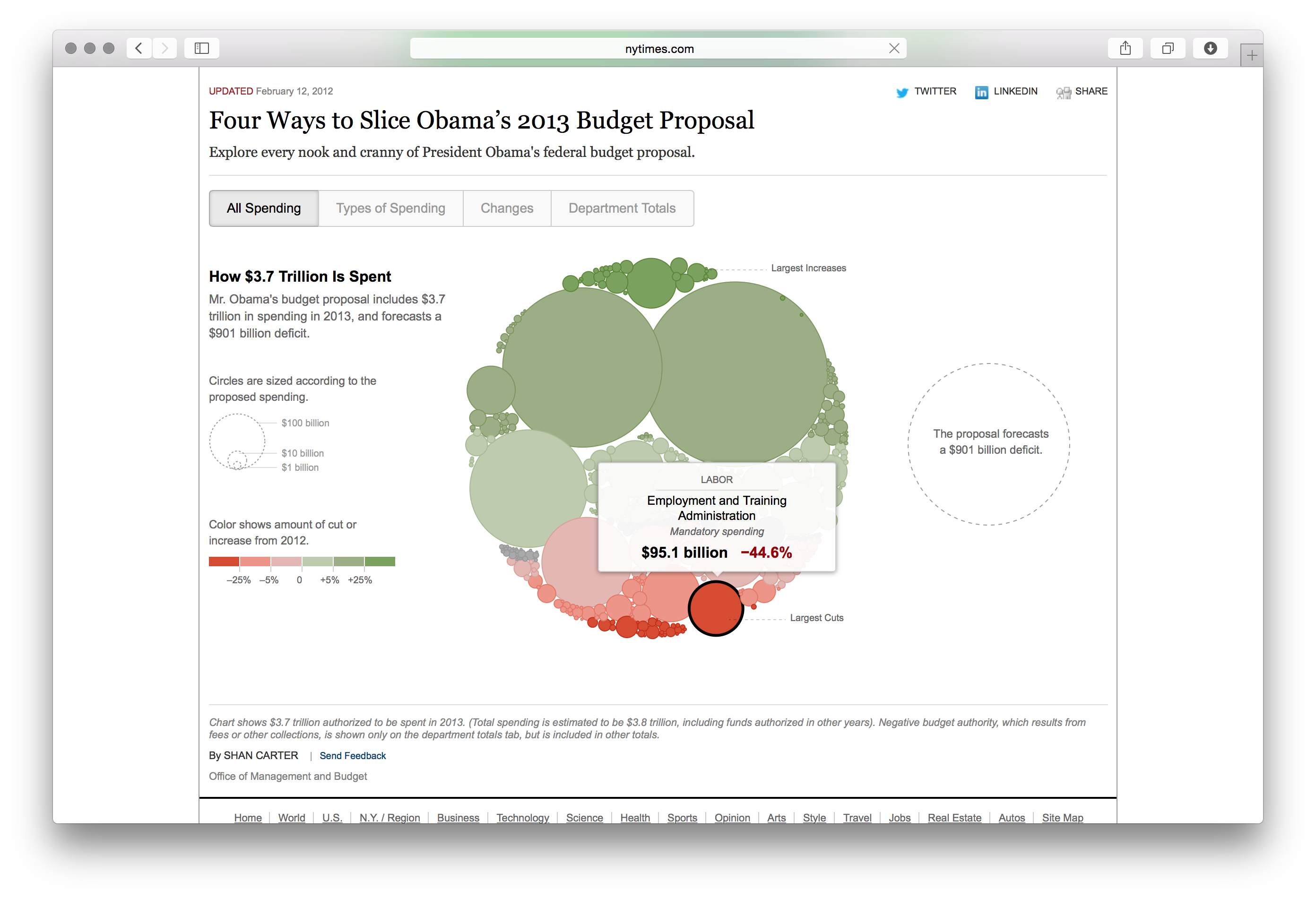
Description
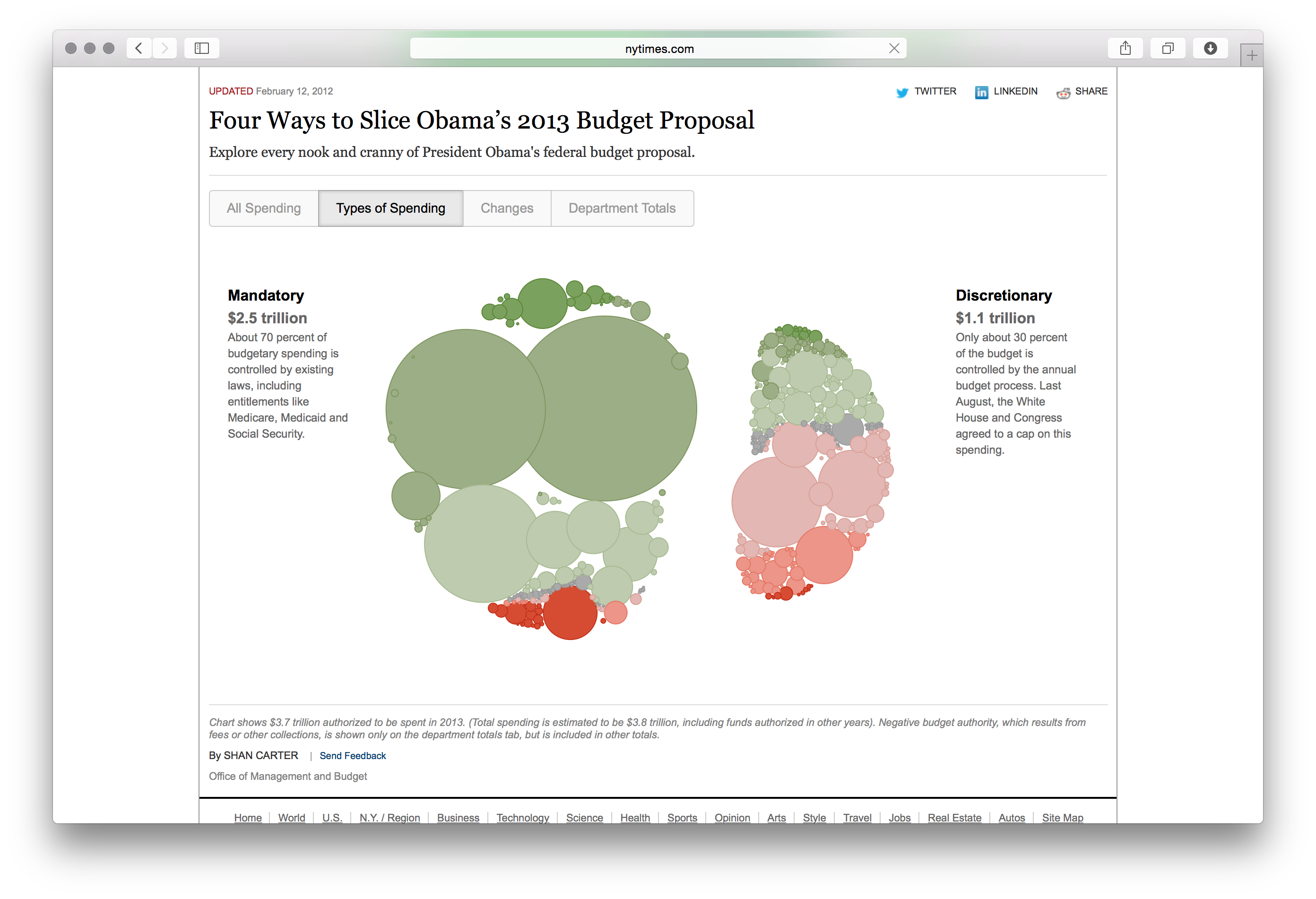
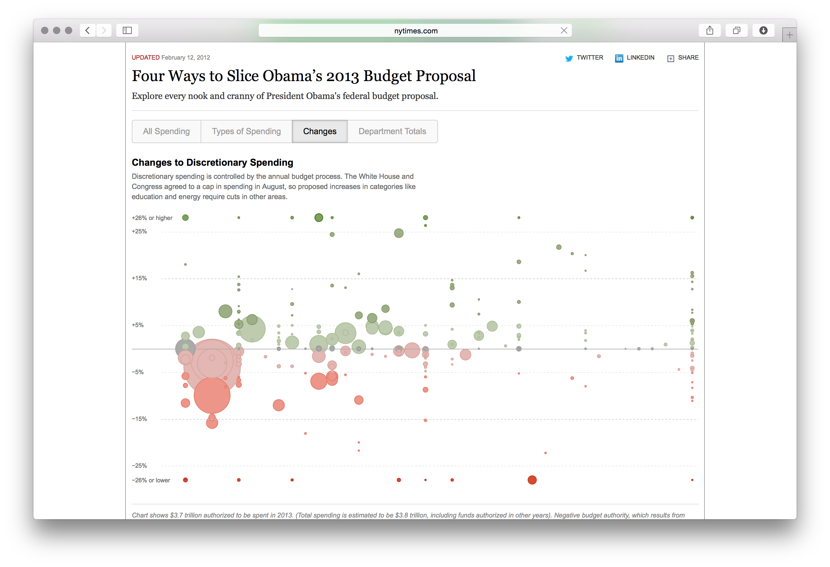
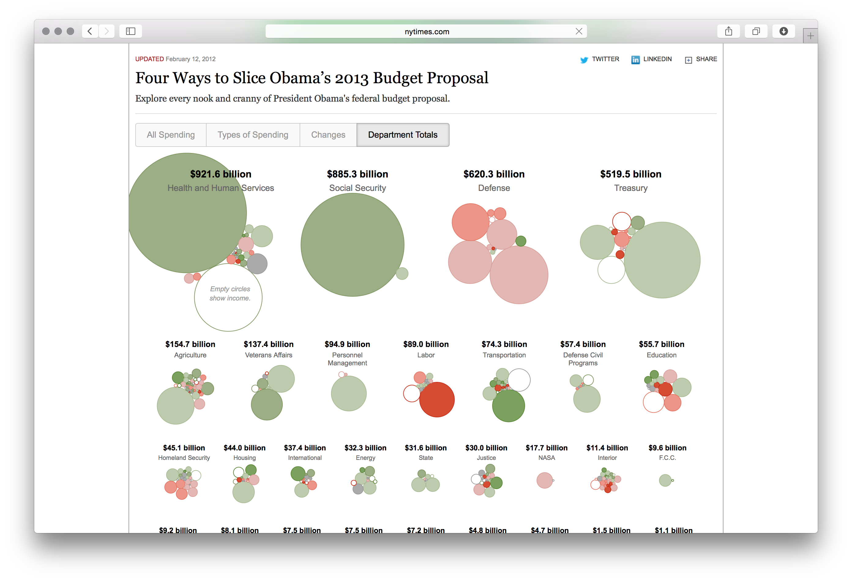
Interactive visualization of the federal budget proposal by the New York Times, breaking down spending categories and allowing readers to explore government finances. The treemap-style graphic shows the relative size of every department and program in the proposed budget, with color coding to indicate increases or decreases from the previous year. Users can drill into categories like defense, healthcare, education, and entitlements to understand where federal dollars go. The NYT produced updated versions of this graphic for multiple budget cycles, making it one of their recurring interactive features for explaining fiscal policy.