Description
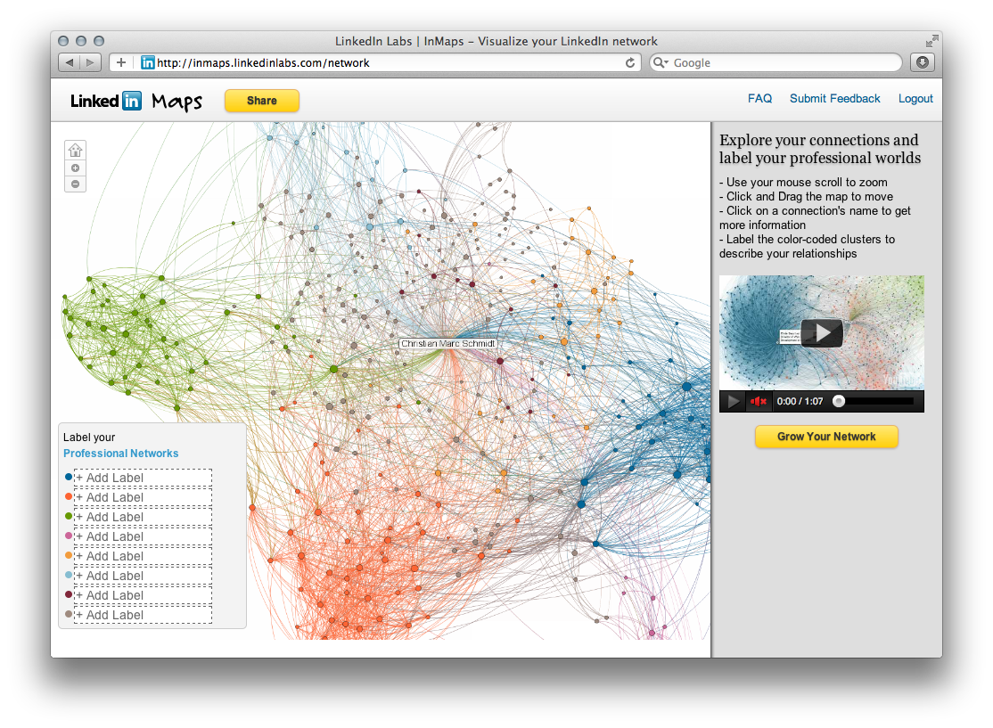
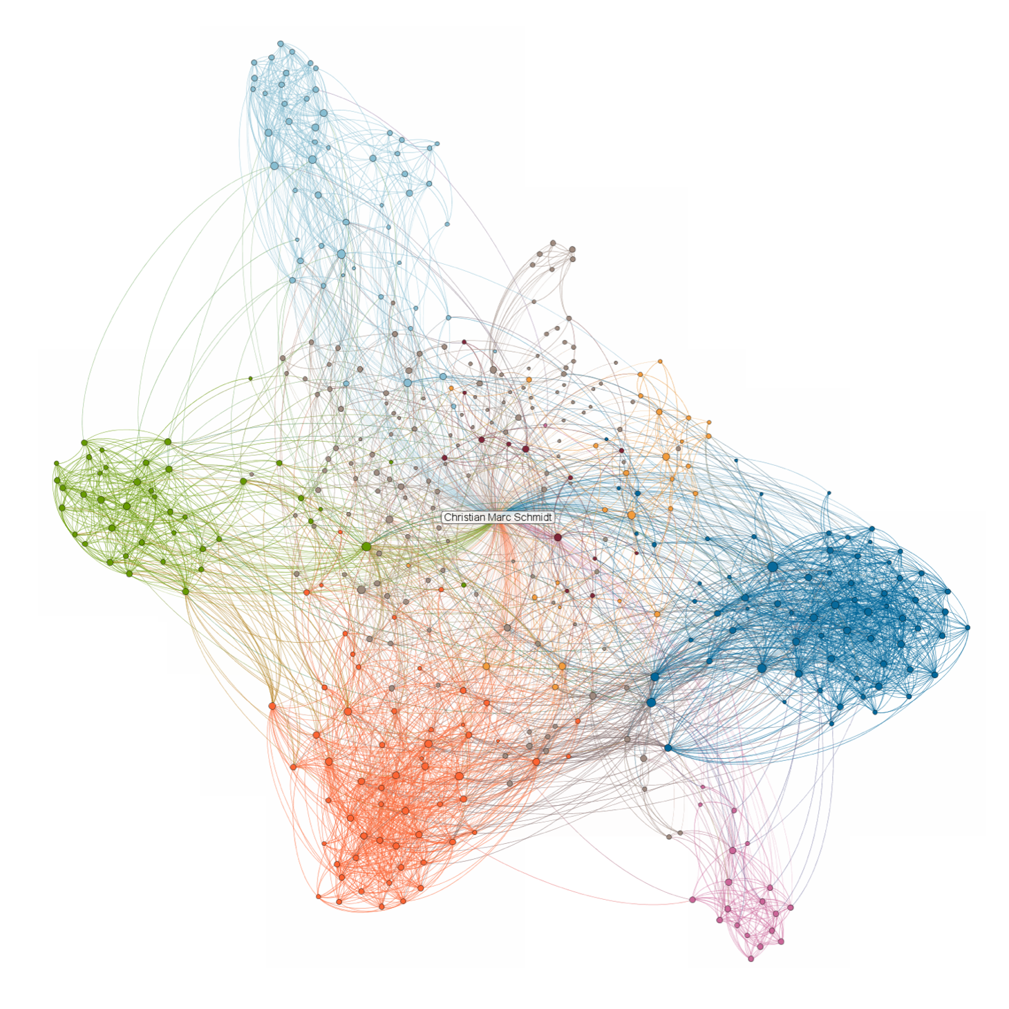
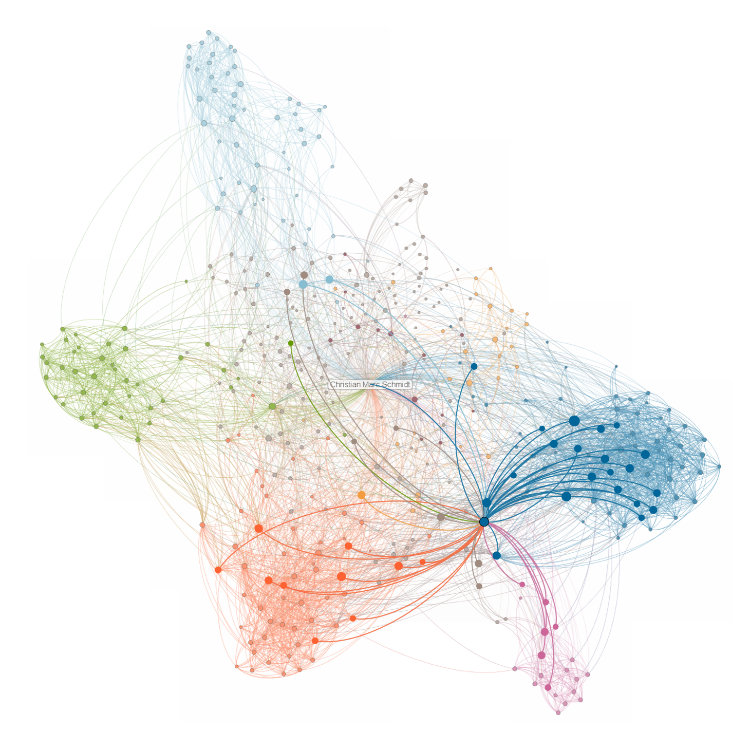
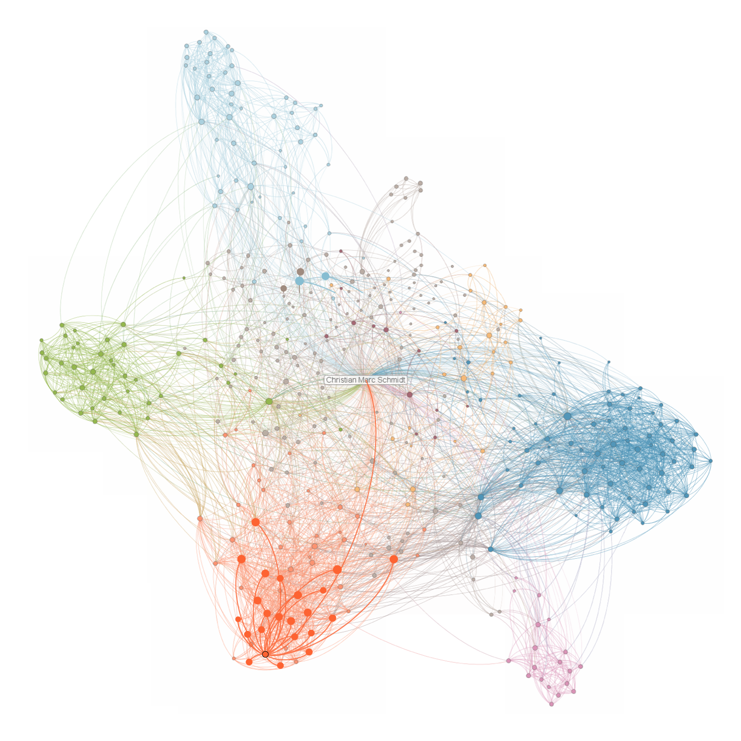
LinkedIn's InMaps project by LinkedIn Labs, launched around 2011. The interactive network visualization generated a personalized map of a user's professional connections, color-coded to represent different affiliations or clusters — previous employers, college classmates, industry groups, or geographic communities. The algorithm automatically detected clusters without user input, revealing how professional networks naturally segment. InMaps was later discontinued (around 2014). The data science team at LinkedIn, which included DJ Patil (later the first US Chief Data Scientist under President Obama), produced InMaps as one of several experimental tools that visualized the social graph underlying professional relationships.