Description
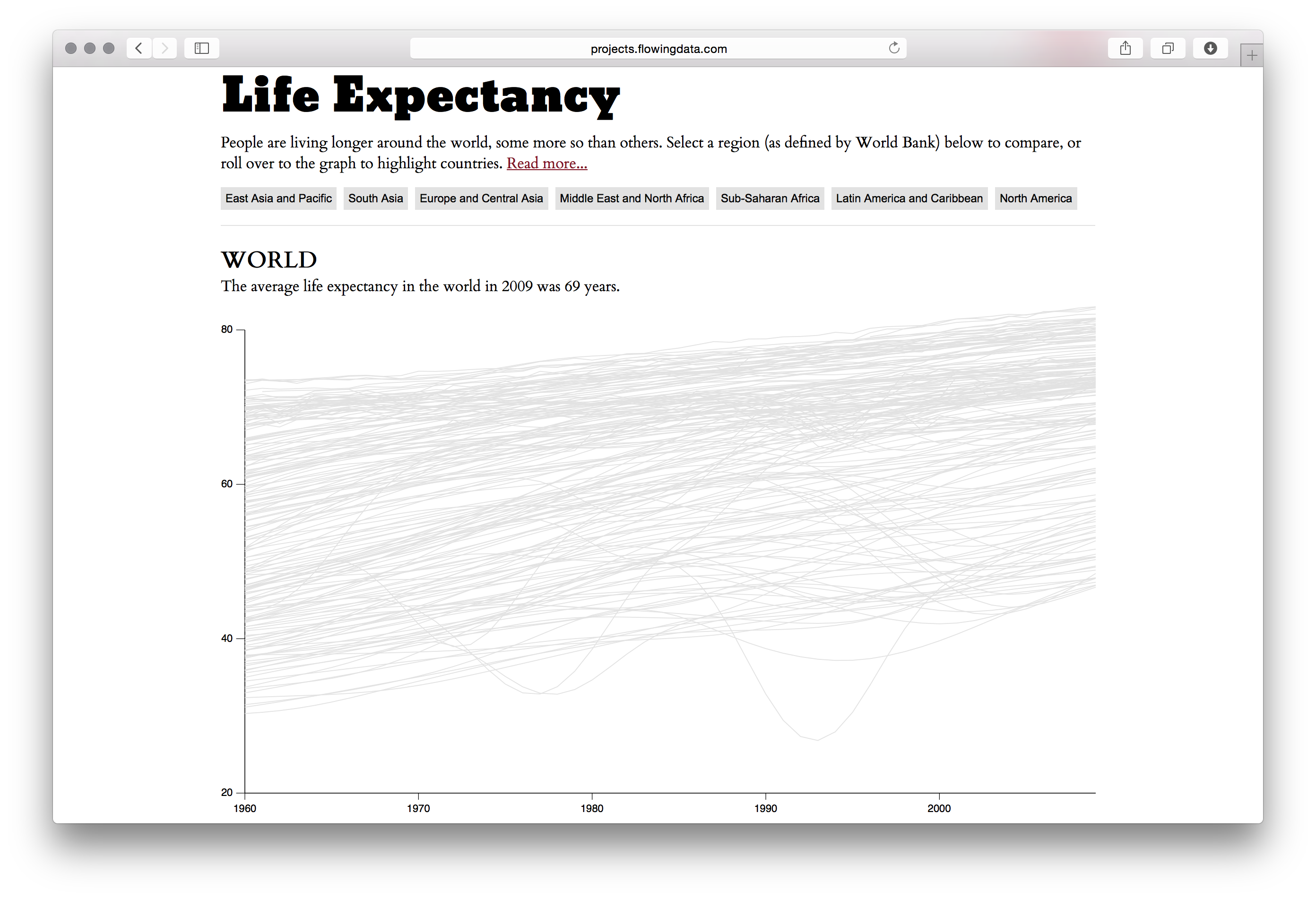
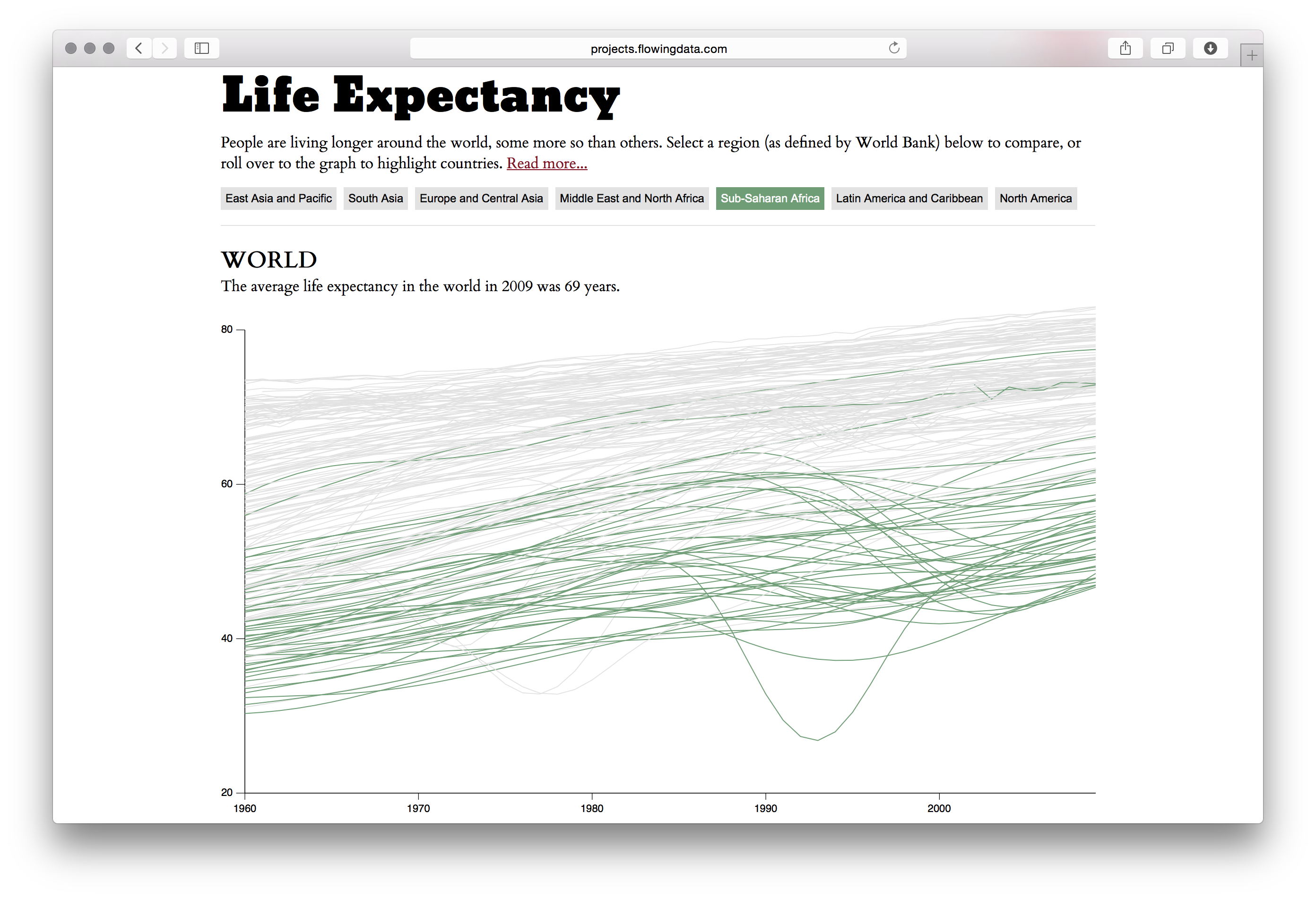
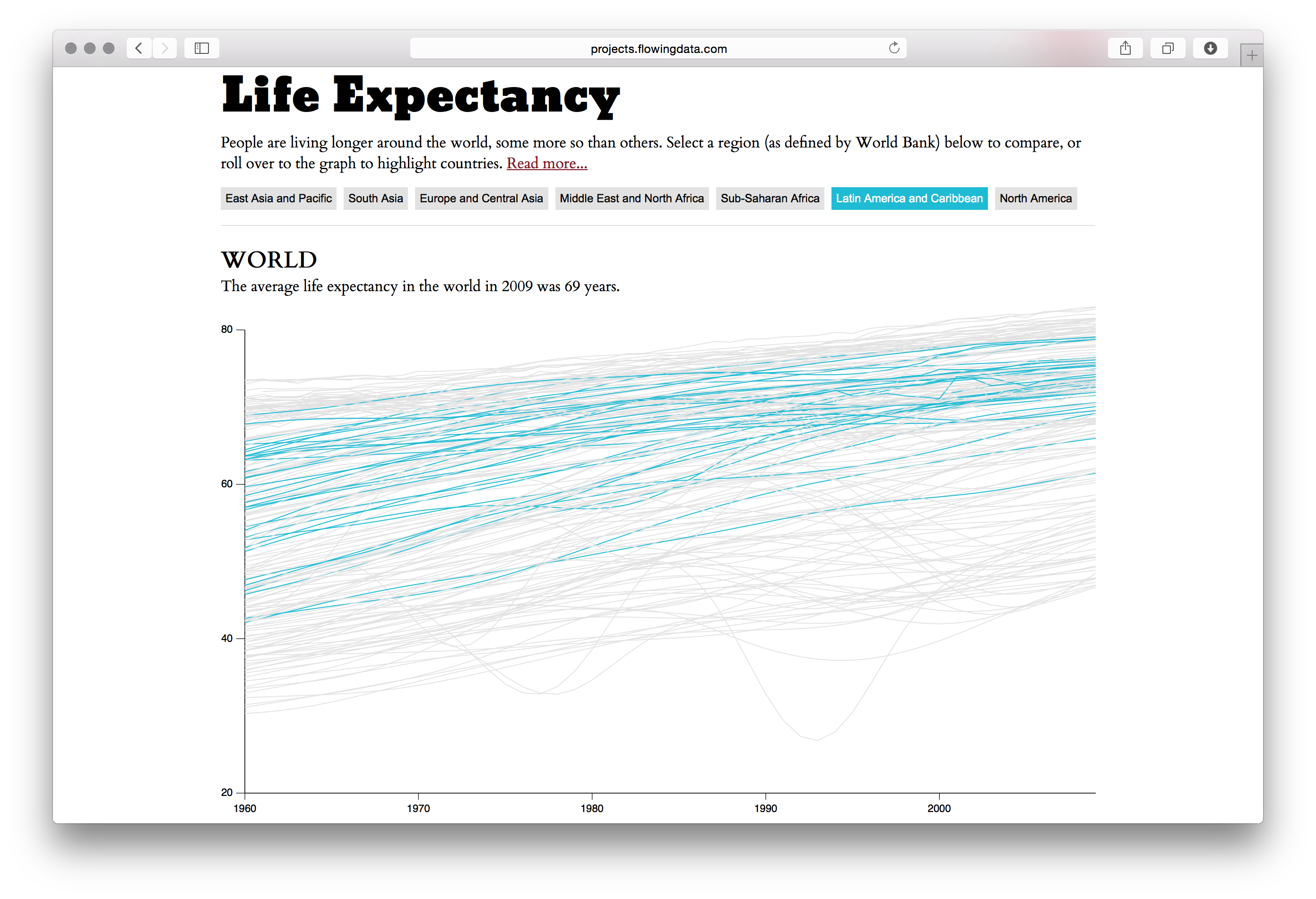
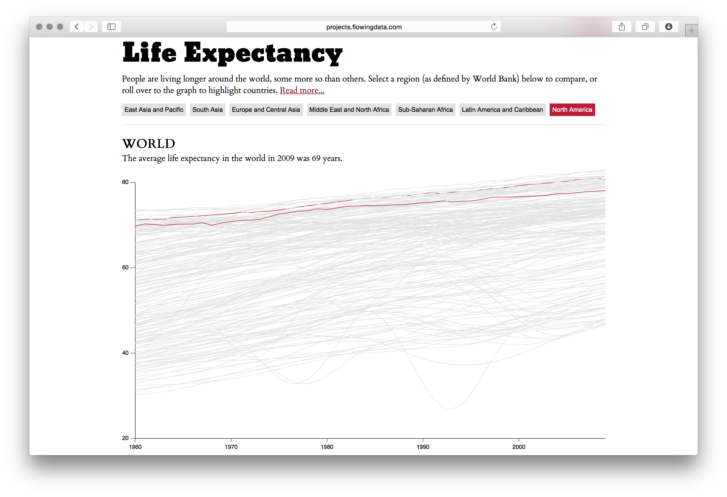
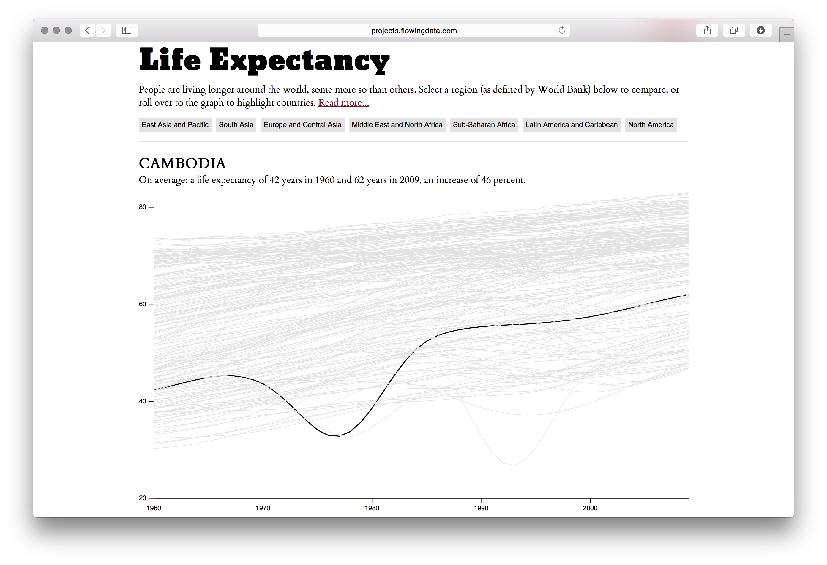
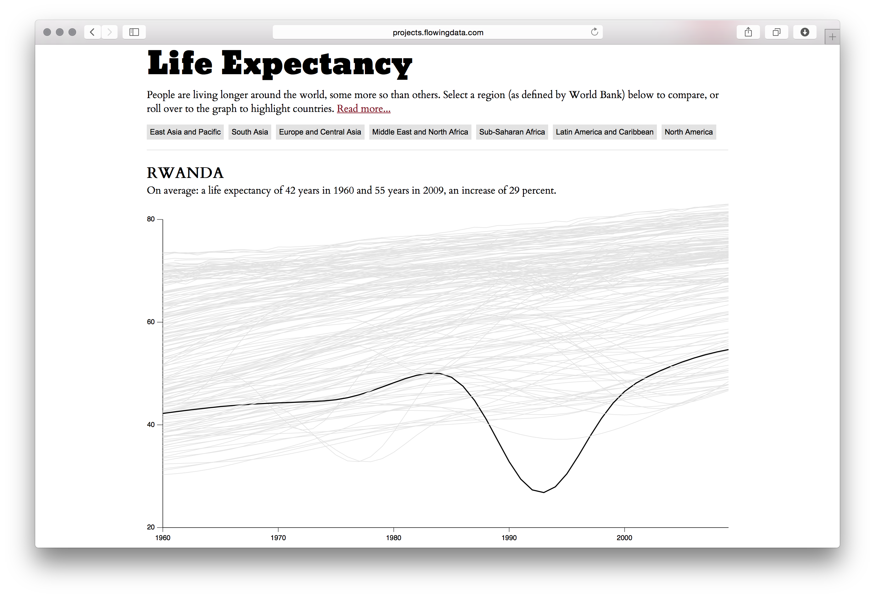
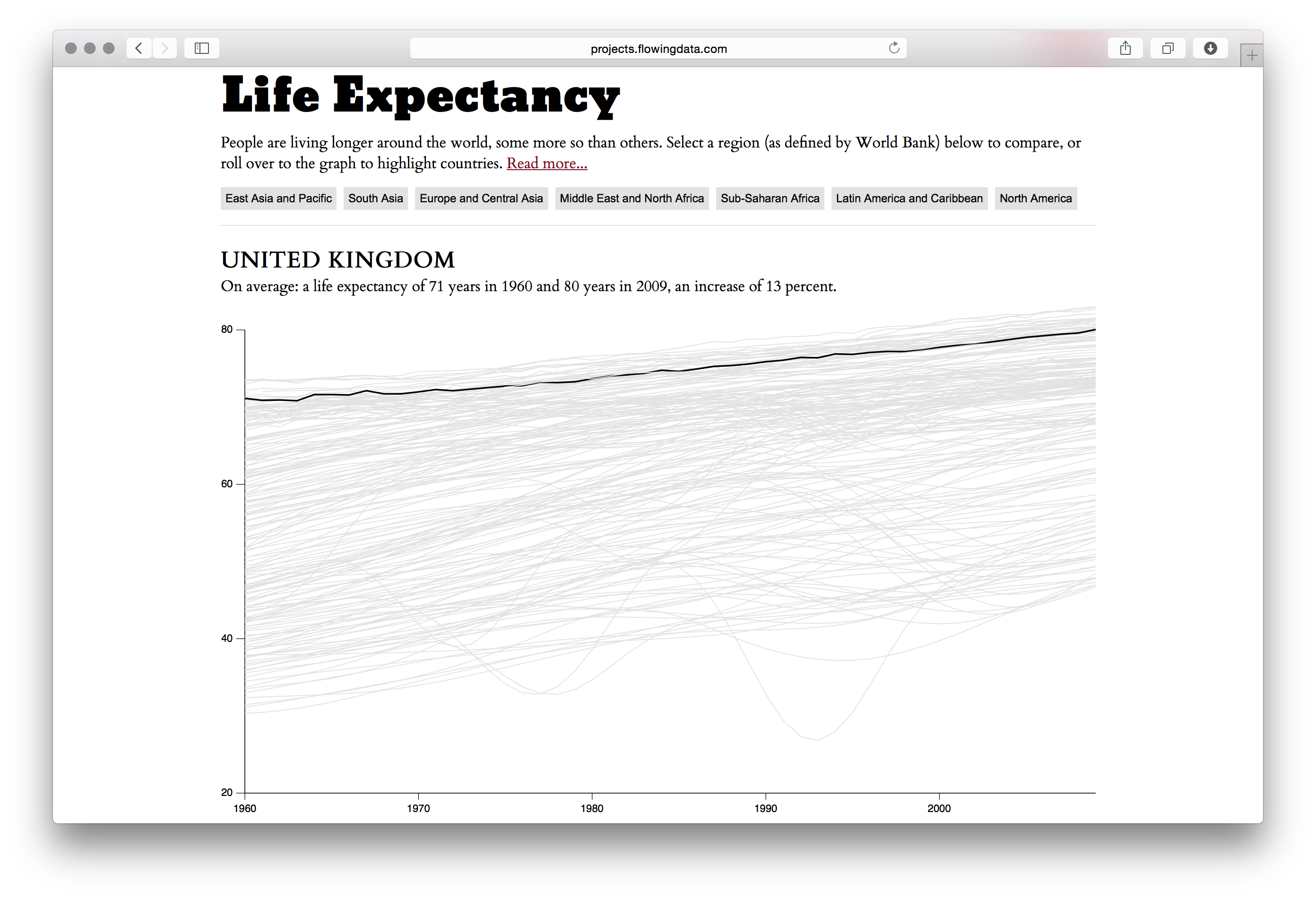
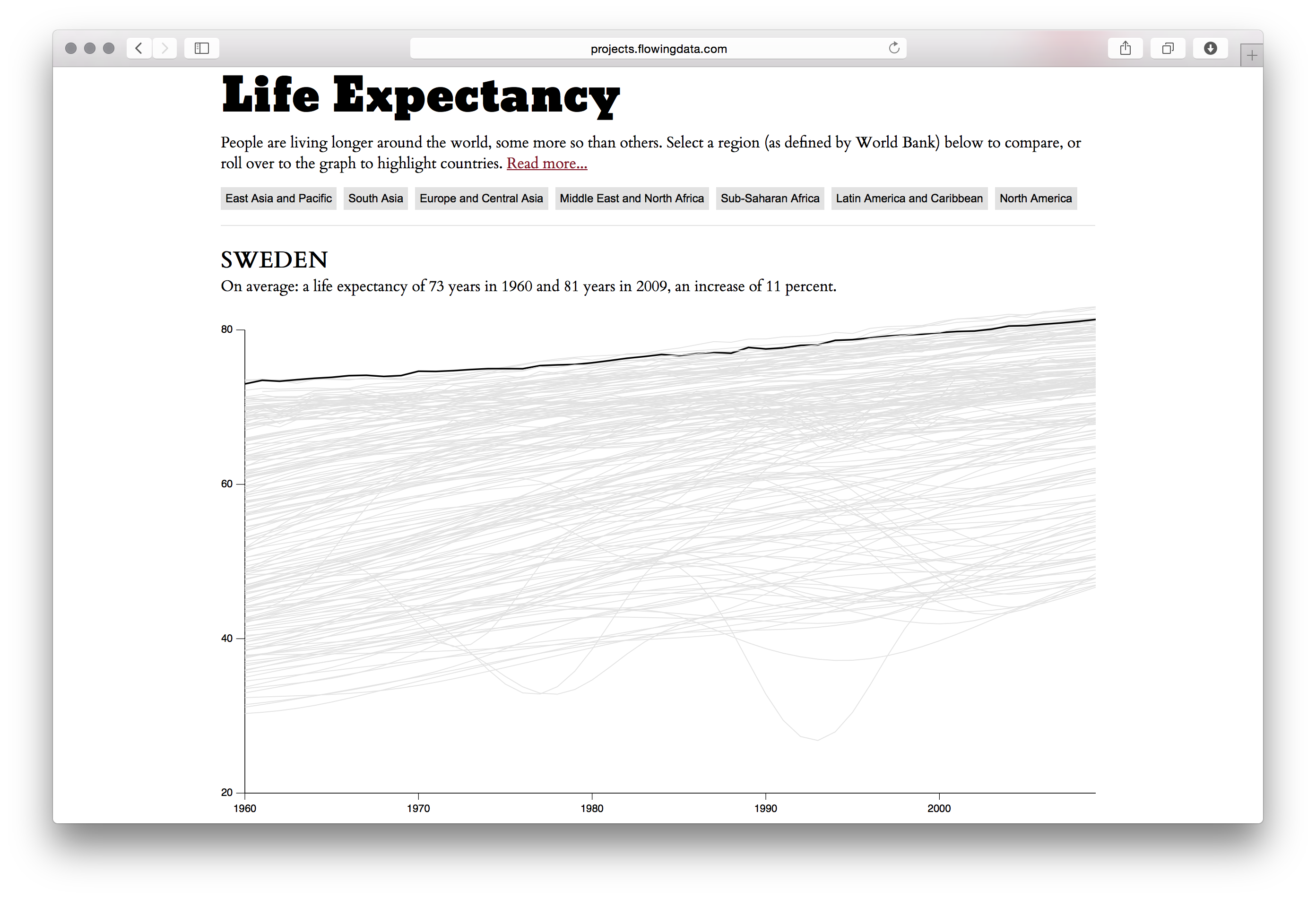
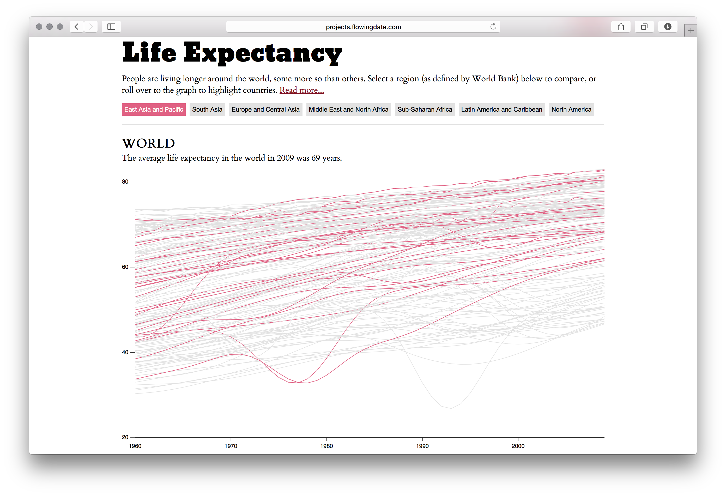
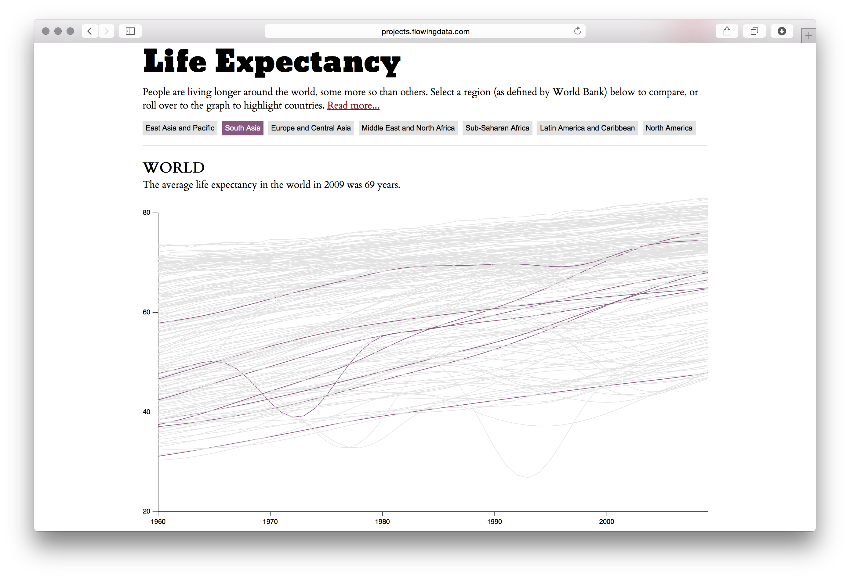
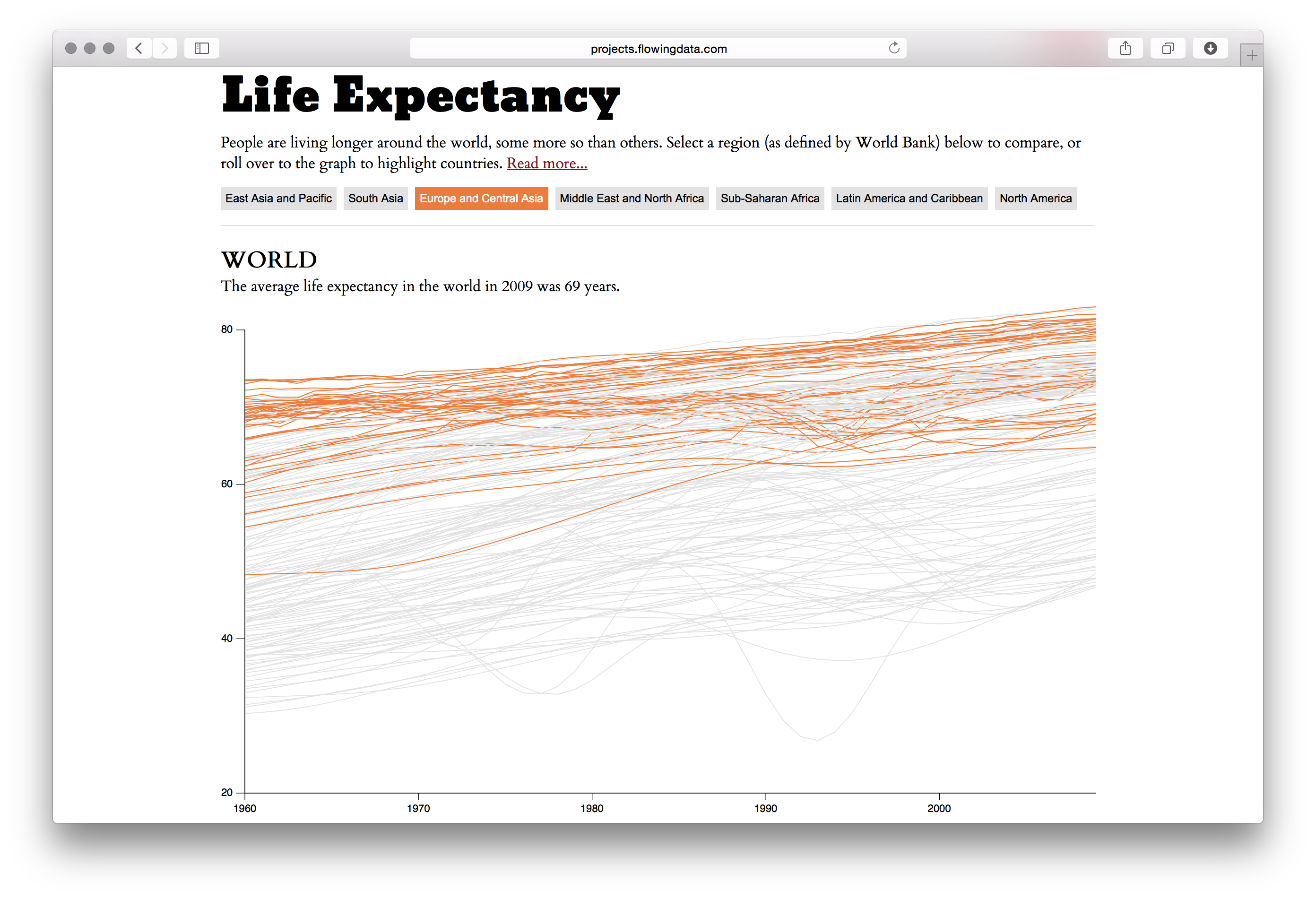
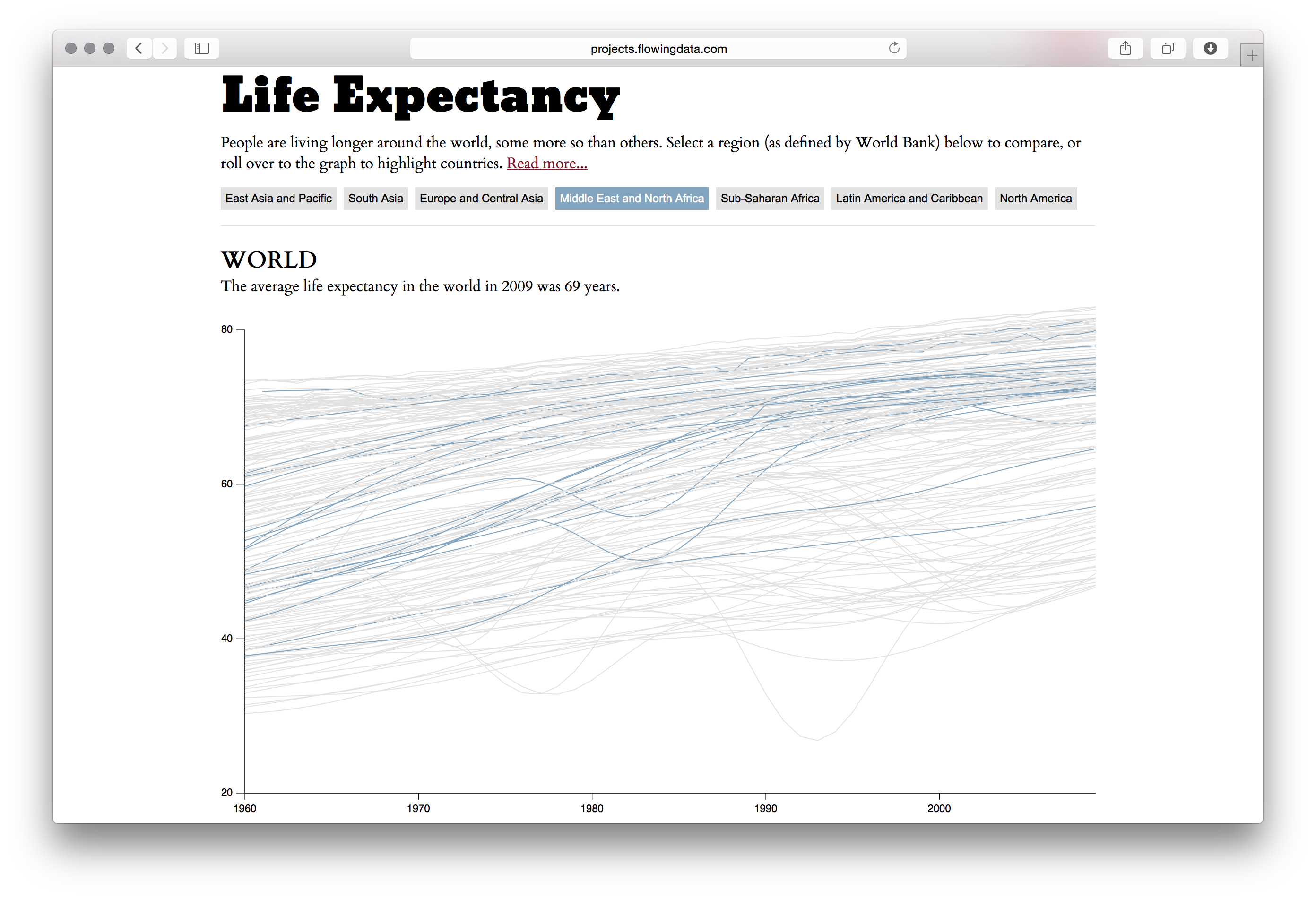
Interactive visualization by Nathan Yau (FlowingData) exploring how life expectancy has changed around the world, using World Bank data. Users can select regions — East Asia and Pacific, South Asia, Europe and Central Asia, Middle East and North Africa, Sub-Saharan Africa, Latin America and Caribbean, and North America — to compare trends, or roll over the graph to highlight individual countries. The average life expectancy worldwide in 2009 was 69 years. Yau is the author of "Visualize This" (2011) and "Data Points" (2013), and has worked as a research mathematical statistician at the US Census Bureau since 2014.