Description
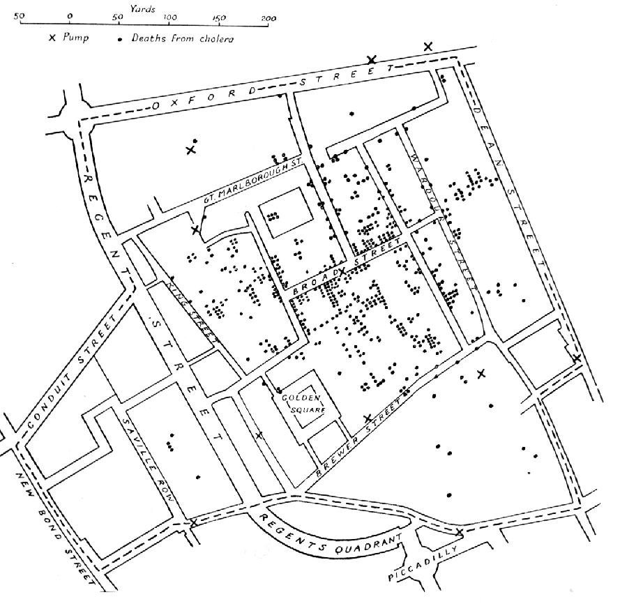
Snow plotted Cholera deaths on a map of Central London. His hypothesis was that the water from a pump well on Broad and Cambridge streets as contaminated. The evidence of deaths in proximity to the well was enough to shut down the pump, after which the epidemic ended. Snow recast the original data from a one-dimensional temporal ordering into a two-dimensional spatial comparison. It’s a successful visualization because it places the data in an appopriate context for assessing cause and effect. A time-series display, a typical method, would have been a poor way of doing so.