Description
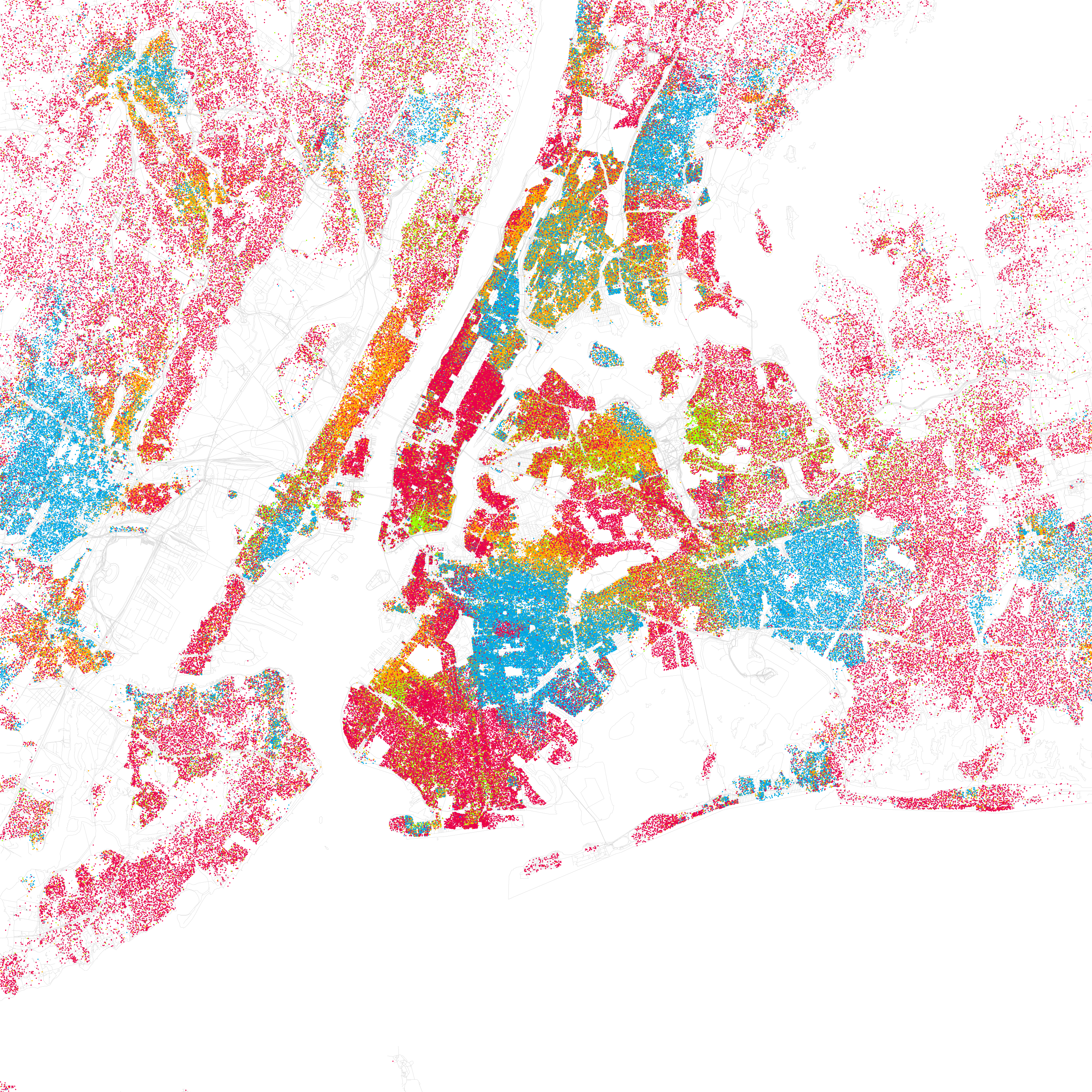
Racial dot map by Eric Fischer placing one dot for each person in the US Census, colored by race/ethnicity. Inspired by Bill Rankin's map of Chicago's racial and ethnic divides, Fischer wanted to see what other cities looked like mapped the same way. Red is White, Blue is Black, Green is Asian, Orange is Hispanic, Gray is Other, and each dot represents 25 people. Data from Census 2000. The visualization reveals segregation patterns and demographic distributions at unprecedented detail.