Description
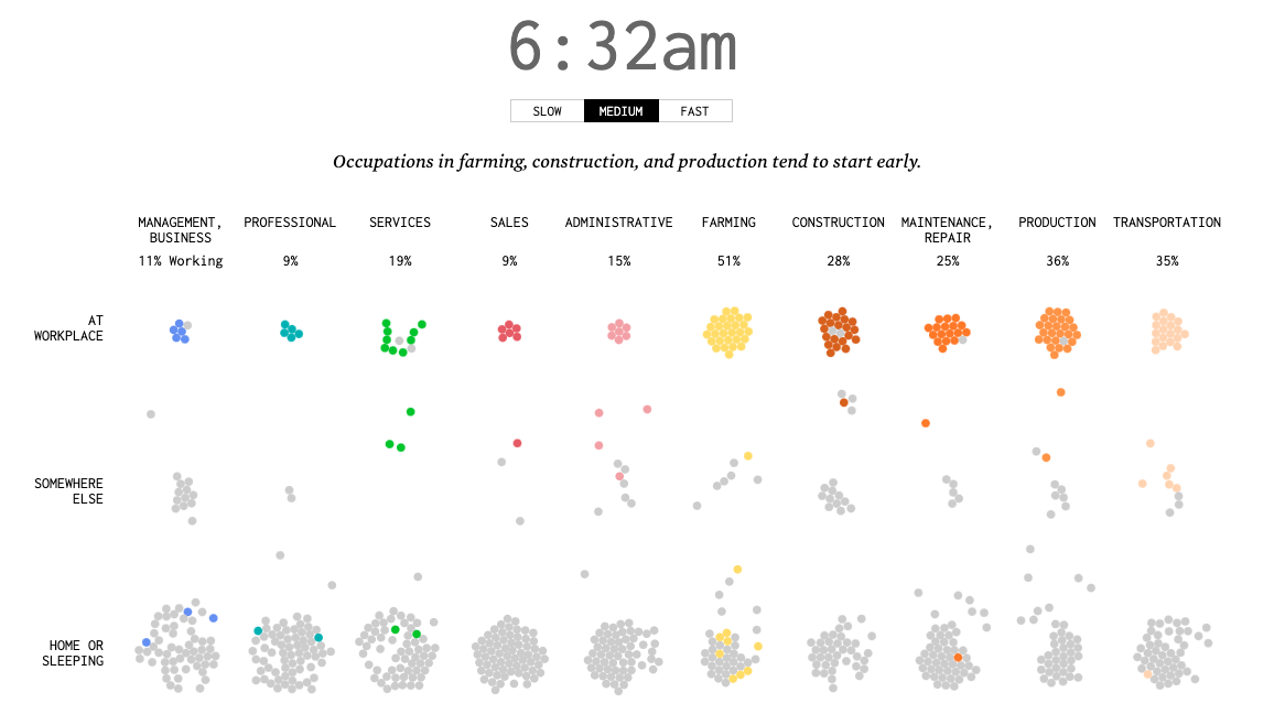
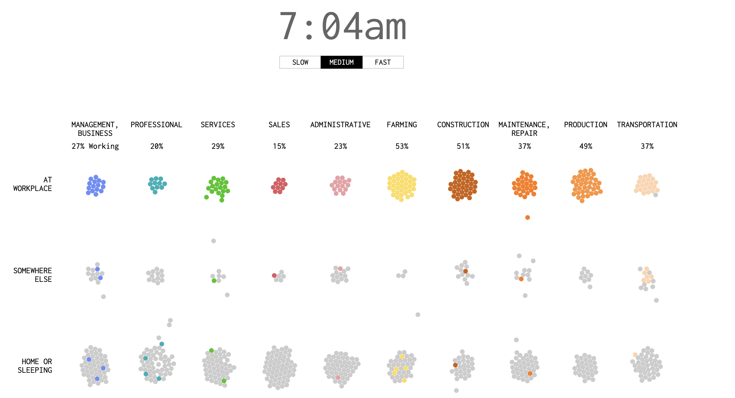
This FlowingData project visualizes how Americans in different occupations spend their time during a typical workday, using American Time Use Survey data from 2011-2015. The animated "moving bubbles" chart shows each person as a dot that changes color to indicate working (non-gray) or not working (gray) states, tracking movement between home, work, and other locations throughout the day.
The visualization demonstrates that not everyone in an occupation works simultaneously and highlights the diversity of daily work patterns beyond the traditional "9 to 5" schedule. By simulating a day for 1,000 employed Americans across different job categories, it provides a nuanced view of work-life patterns, showing the fluidity of modern work schedules and the complex interplay between professional and personal time throughout the day.