Description
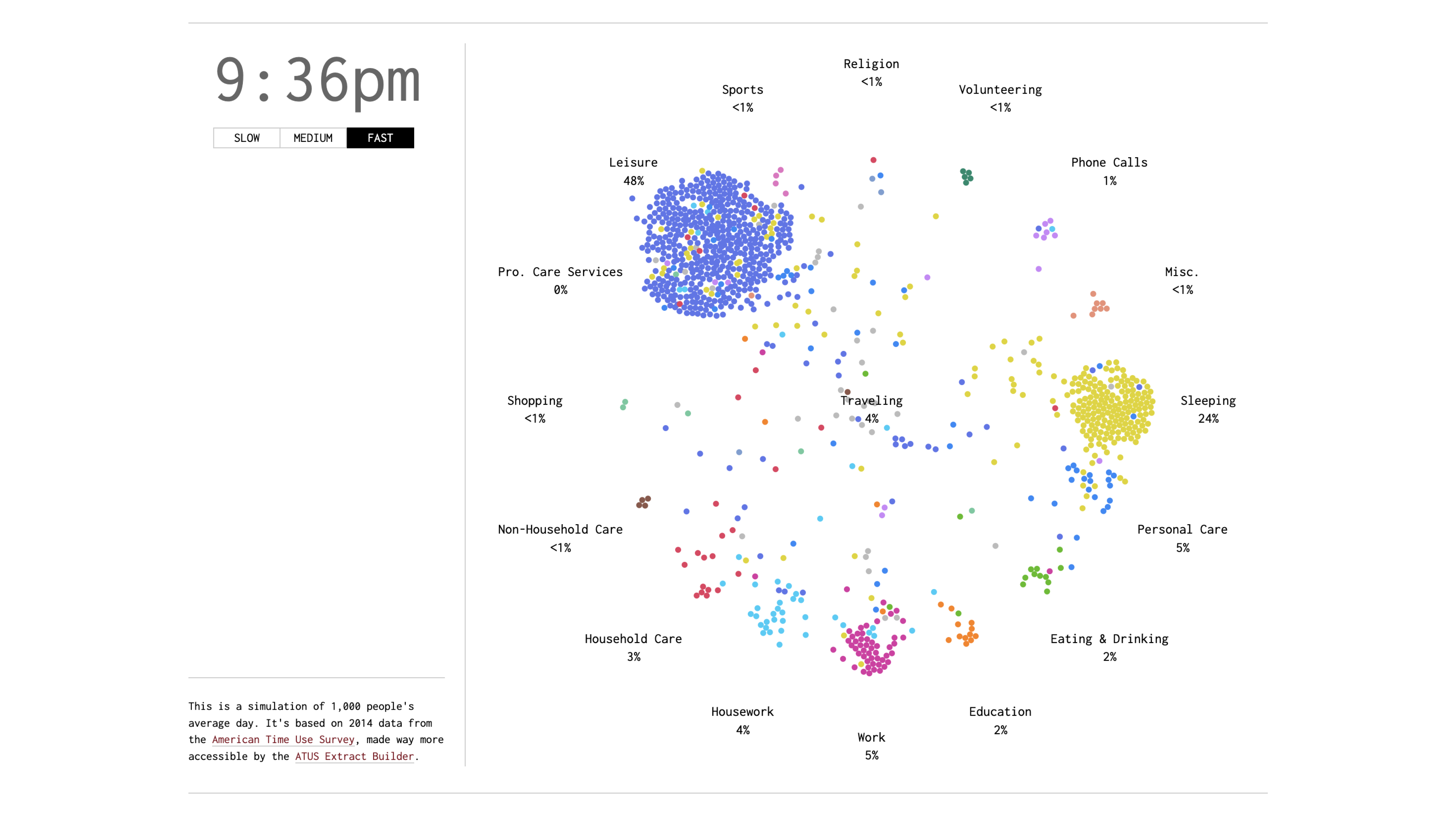
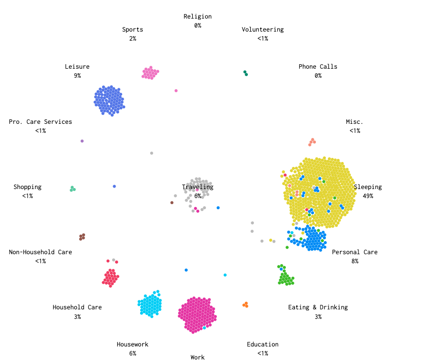
This FlowingData visualization explores how Americans spend their time throughout a 24-hour day using data from the 2014 American Time Use Survey. The project simulates a day for 1,000 representative Americans using transition probabilities between activities for every minute, modeled as a time-varying Markov chain.
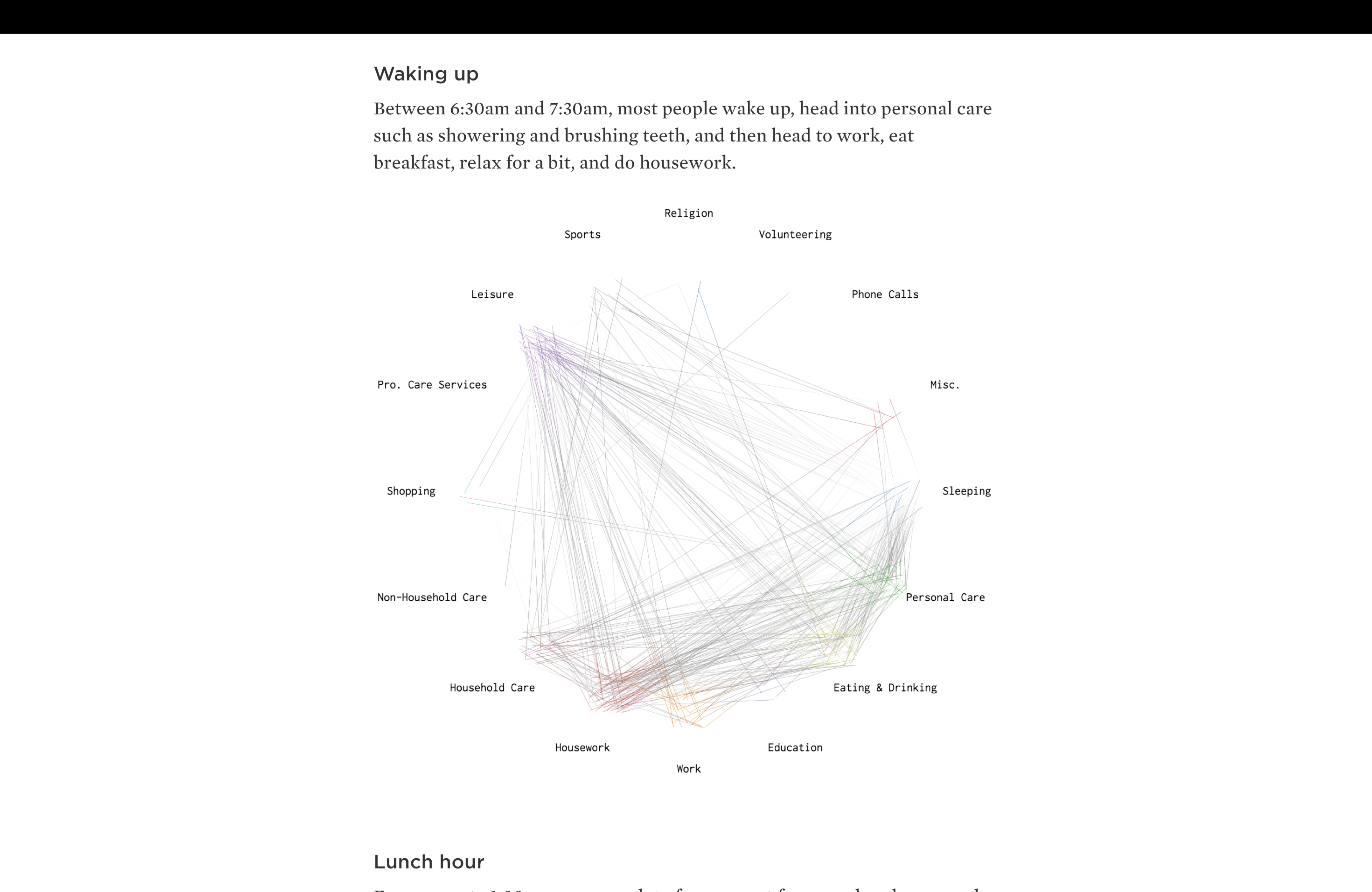
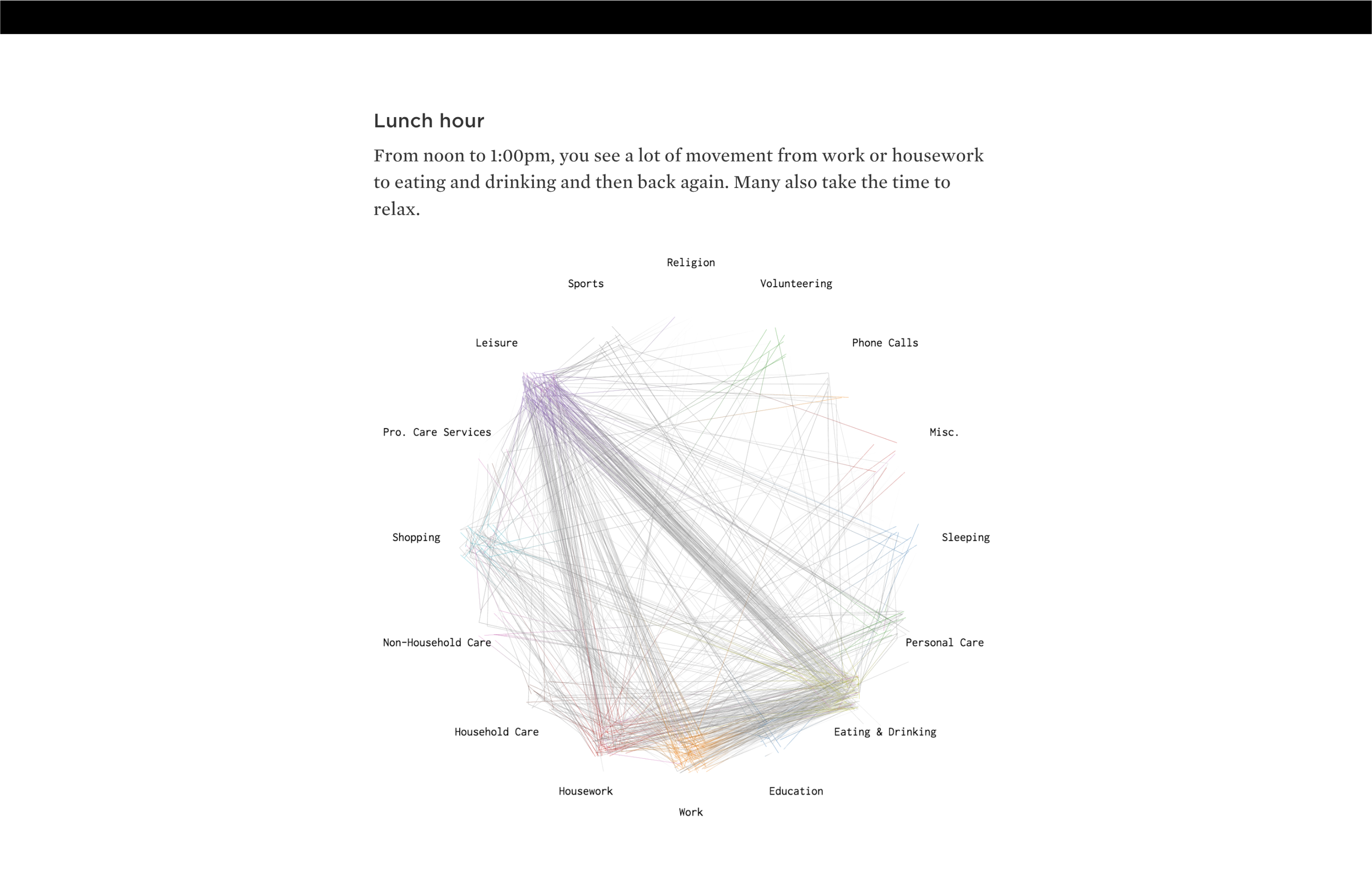
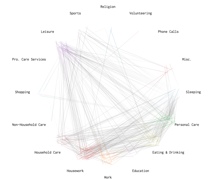
The visualization uses a moving bubble chart where each color-coded dot represents a person engaged in different activities, animated from 4:00am to midnight. This approach reveals granular, individual-level activity patterns that aggregate into broader population trends, showing typical daily rhythms like morning preparation (6:30-7:30am), lunch hour movements, and evening wind-down periods. The interactive, animated format makes complex time-use data engaging and comprehensible by showing how activities flow and change throughout the day.